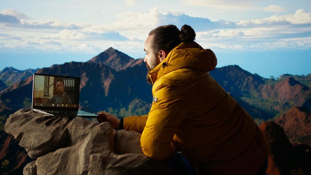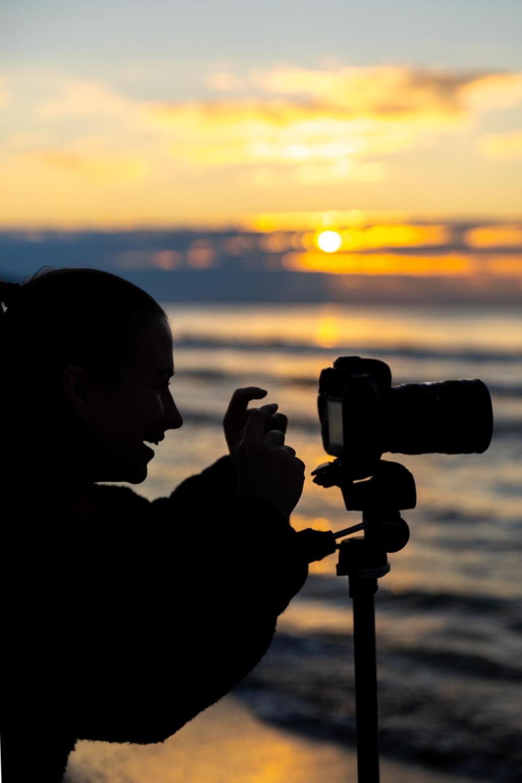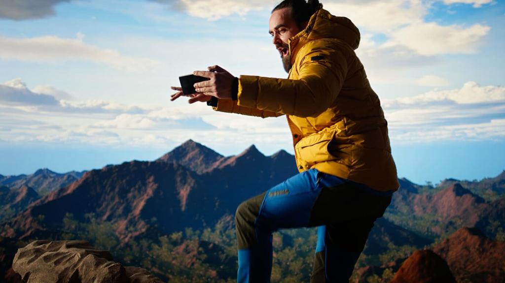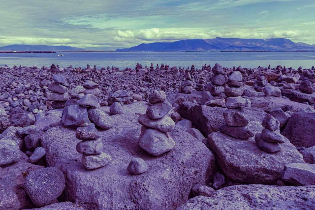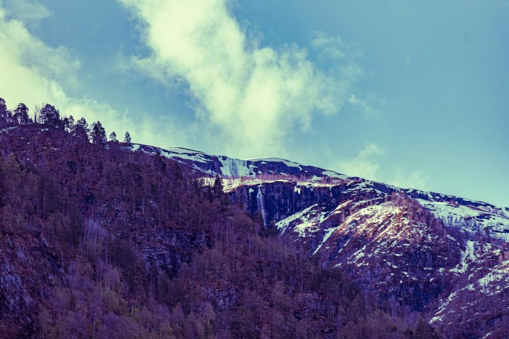
Beyond the Rule of Thirds: Balance with Intent
Use the rule of thirds to position horizons and anchors where the eye naturally settles. Placing a ridge, lighthouse, or sunlit rock on an intersection creates stability, then leaves room for sky drama and narrative flow.
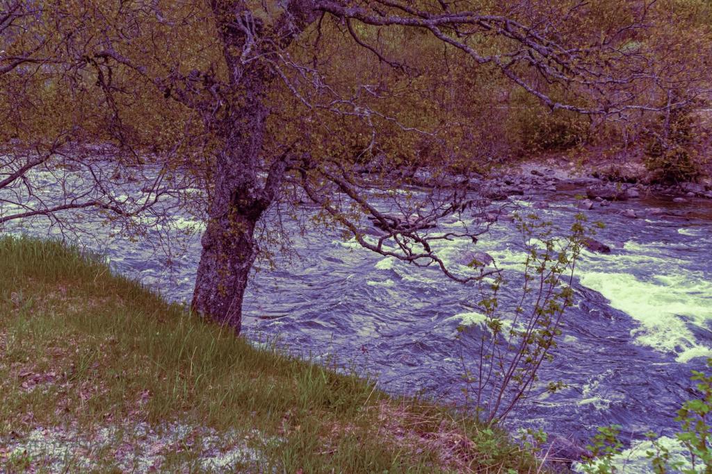
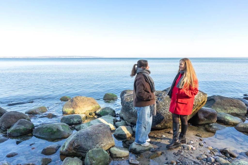
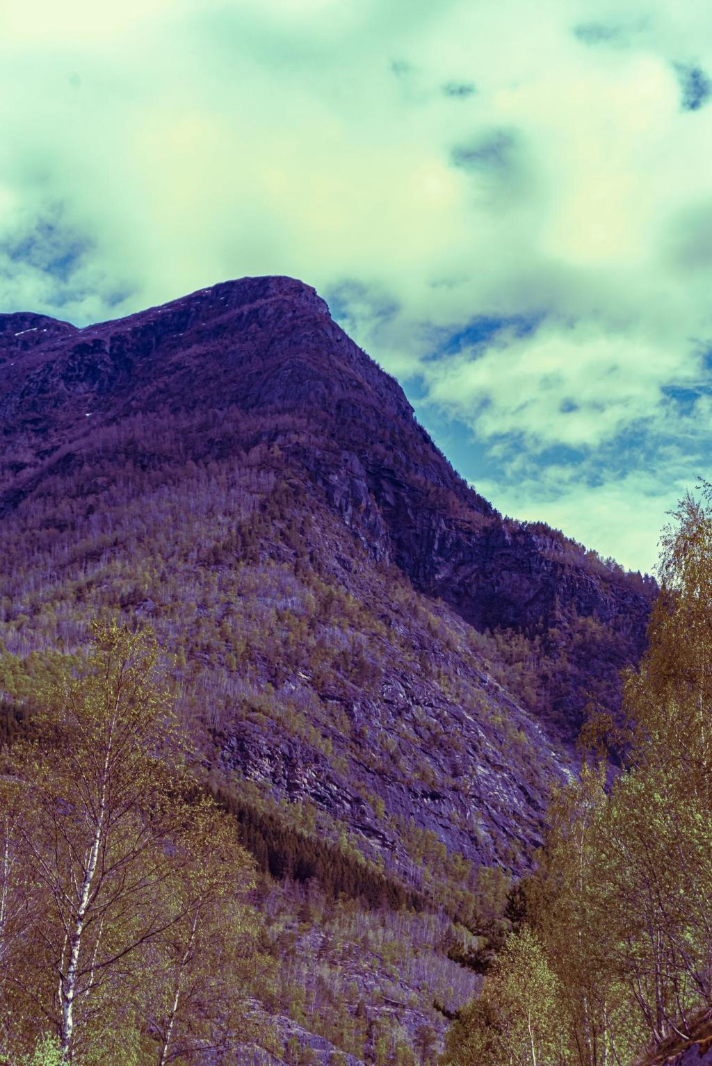
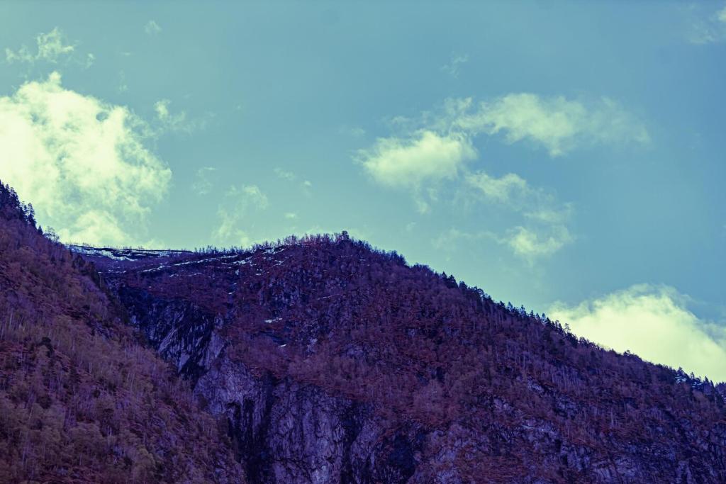
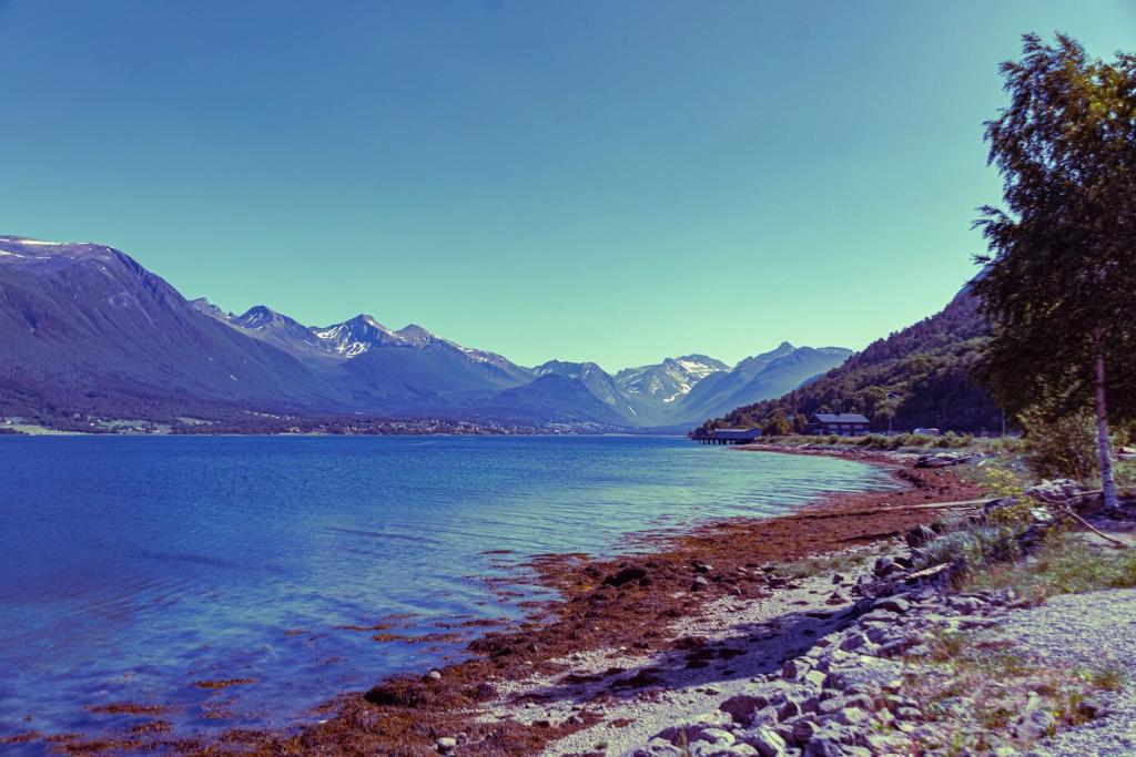
Beyond the Rule of Thirds: Balance with Intent
Some scenes demand symmetry: perfect reflections, mirrored peaks, and still lakes reward a centered horizon. Break the rule deliberately, not carelessly, letting calm geometry communicate serenity, balance, and a sense of timeless stillness.