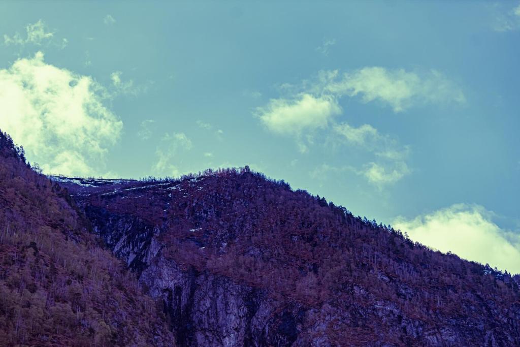

Color Grading That Honors the Landscape
Instead of chasing perfect neutrality, choose a white balance that conveys the session’s feeling. A slightly warmer balance can celebrate a golden-hour glow, while cooler tones can emphasize alpine stillness. Make small moves, compare against neutral targets, and trust your emotional memory of the scene on location.
Color Grading That Honors the Landscape
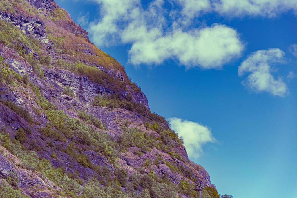
Use HSL to separate overlapping greens so pine, moss, and meadow read distinctly. De-saturate just enough to prevent neon foliage while keeping water true to its source. One autumn hike taught me to nudge yellow luminance down, subtly deepening leaf texture without turning the hillside into a cartoon.
Color Grading That Honors the Landscape
Employ shadows, midtones, and highlights wheels to craft complementary harmonies—cool shadows, warm highlights, and neutral midtones can feel cinematic yet believable. Keep saturation light, balance carefully, and watch the vectorscope if available. A tiny shift often transforms mood more convincingly than heavy-handed global saturation ever could.